
Renovating Internshala resume options to enkindle better user control
Tailored resume encourages applicants to apply at multiple job opportunities
Renovating Internshala resume options to enkindle better user control
Tailored resume encourages applicants to apply at multiple job opportunities


Background
Today, interns are applying for variety of internship opportunities
For internship seekers, it is difficult to land on something specific when they are fresh and seeking opportunities. it is commonplace to apply for jobs ranging from, say design services to language translation services, or even AI prompter. There is an opportunity to customize the reach of students or professionals (part timer workers too), to make sure their efforts are not lost in a generic resume that seems to be all over the place.
Problem
The resume loophole
Internshala is designed to help students find internships, part time jobs, and full time jobs too, but the users barely have a control over their “golden ticket”- their resumes, because...
The resume updated on profile will automatically and compulsarily be sent to the employer when they apply for the job
The profile resume cannot be tailerd according to the job, it remains the same once updated.
They end up updating all the links, portfolios in the same resume.

The updated resume continues to
the same. Say, you apply for graphic
design job and digital marketing
internship at the same time. The
updated resume remains the same.
The updated resume remains the
same throughout the applications.
Resume can be viewed through
another action which is editing.
A preview is not available.
The application screens are not
uniform. Whole process of submission
is cluttered and squished into a
single screen. Even the cta buttons
are not similar.

The original design
The updated resume continues to the same. Say, you apply for graphic design job and digital marketing internship at the same time.The
updated resume remains the same.
The updated resume remains the same throughout the applications. Resume can be viewed through another action which is editing. A preview is not available.
The application screens are not uniform. Whole process of submission
is cluttered and squished into a single screen. Even the cta buttons are not similar.
The original design
The updated resume continues to
the same. Say, you apply for graphic
design job and digital marketing
internship at the same time. The
updated resume remains the same.
The updated resume remains the
same throughout the applications.
Resume can be viewed through
another action which is editing.
A preview is not available.
The application screens are not
uniform. Whole process of submission
is cluttered and squished into a
single screen. Even the cta buttons
are not similar.
The original design
Solution
Discovering an option to edit and recreate more resumes
Adding and recreating more resume involved processing and rethinking total two journeys. One, is the discovery of the resume, and the other is the usage of the resume.
Solution
Discovering an option to edit and recreate more resumes
Adding and recreating more resume involved processing and rethinking total two journeys. One, is the discovery of the resume, and the other is the usage of the resume.
Solution
Discovering an option to edit and recreate more resumes
Adding and recreating more resume involved processing and rethinking total two journeys. One, is the discovery of the resume, and the other is the usage of the resume.
Setting Job Preferences
There is already a preferences section outside the resume feature which caters to the user’s take on choosing the job. Yet, adding a preference here helps to categorise the resume as it creates a label that is easier to choose from the while applying for a job.
Setting Job Preferences
There is already a preferences section outside the resume feature which caters to the user’s take on choosing the job. Yet, adding a preference here helps to categorise the resume as it creates a label that is easier to choose from the while applying for a job.
Setting Job Preferences
There is already a preferences section outside the resume feature which caters to the user’s take on choosing the job. Yet, adding a preference here helps to categorise the resume as it creates a label that is easier to choose from the while applying for a job.
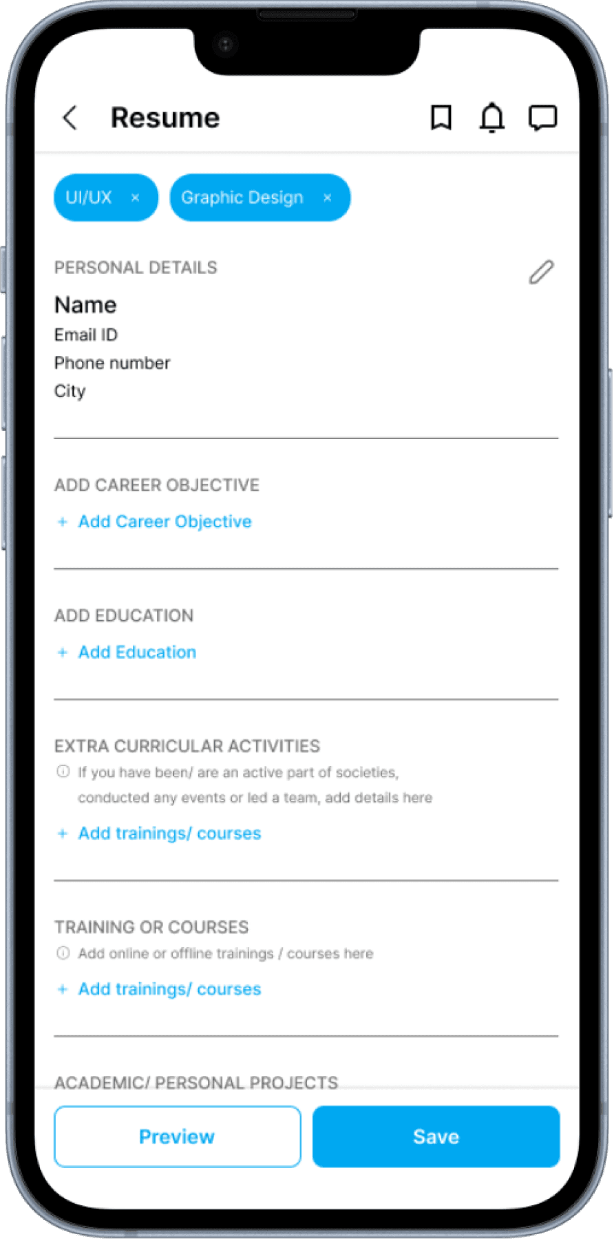
Providing user Control
By giving a leeway to choose or come back to attaching preferences to resume building. This helps in marking and bifurcating the type of resume that is to be edited.
Visibility of preferences
Setting a mark to tailer the resume according to the set of preferences. Plus, giving an option to preview the resume, this gives more flexibility and confidence to the user.

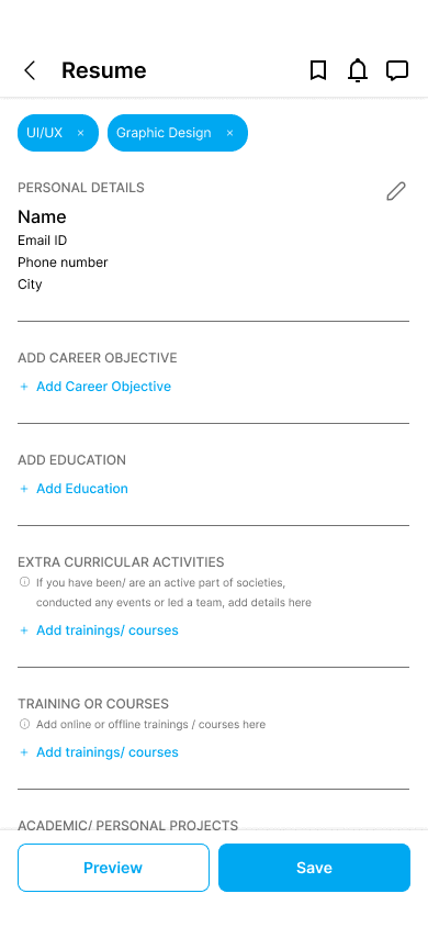

The new design
Providing user Control
By giving a leeway to choose or come back to attaching preferences to resume building. This helps in marking and bifurcating the type of resume that is to be edited.
Visibility of preferences
Setting a mark to tailer the resume according to the set of preferences. Plus, giving an option to preview the resume, this gives more flexibility and confidence to the user.
The new design
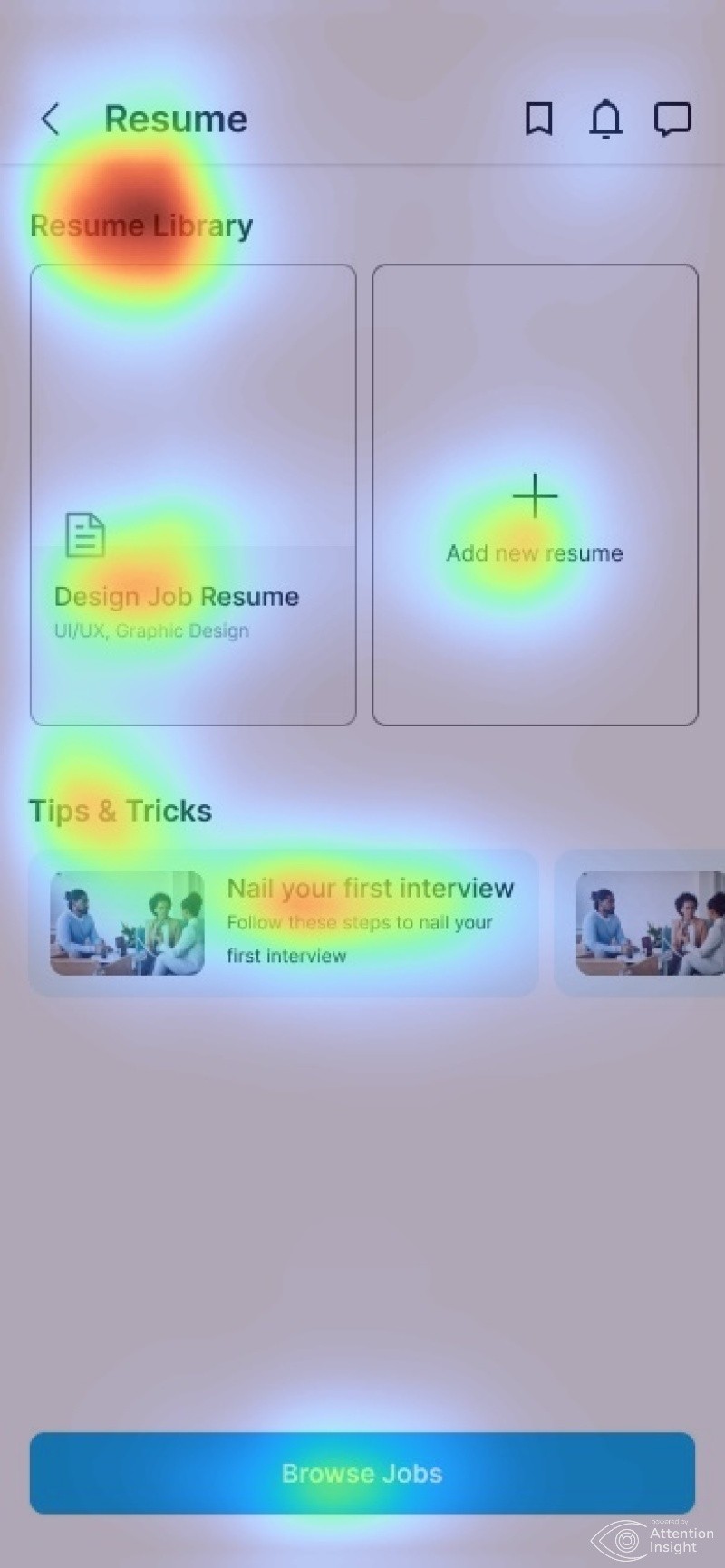
Save by name to simplify accessibility
Just like a file, it is easy to track and access the resume according to the saved name. To do so, I chose to design an overlay for an immediate and useful action.
To store the set of resume, I decided to introduce resume library with a bunch of pro tips. This sets the ground for the user to kick off with the browsing cta, as and when the user is finished with customising library.


Save for easy access
To ignore the hassle of lost files and find the tailored resume easily at the time.
Resume Library
Providing space to recreate or tailor resume.
Save for easy access
To ignore the hassle of lost files and find the tailored resume easily at the time.
Resume Library
Providing space to recreate or tailor resume.
Save for easy access
To ignore the hassle of lost files and find the tailored resume easily at the time.
Resume Library
Providing space to recreate or tailor resume.
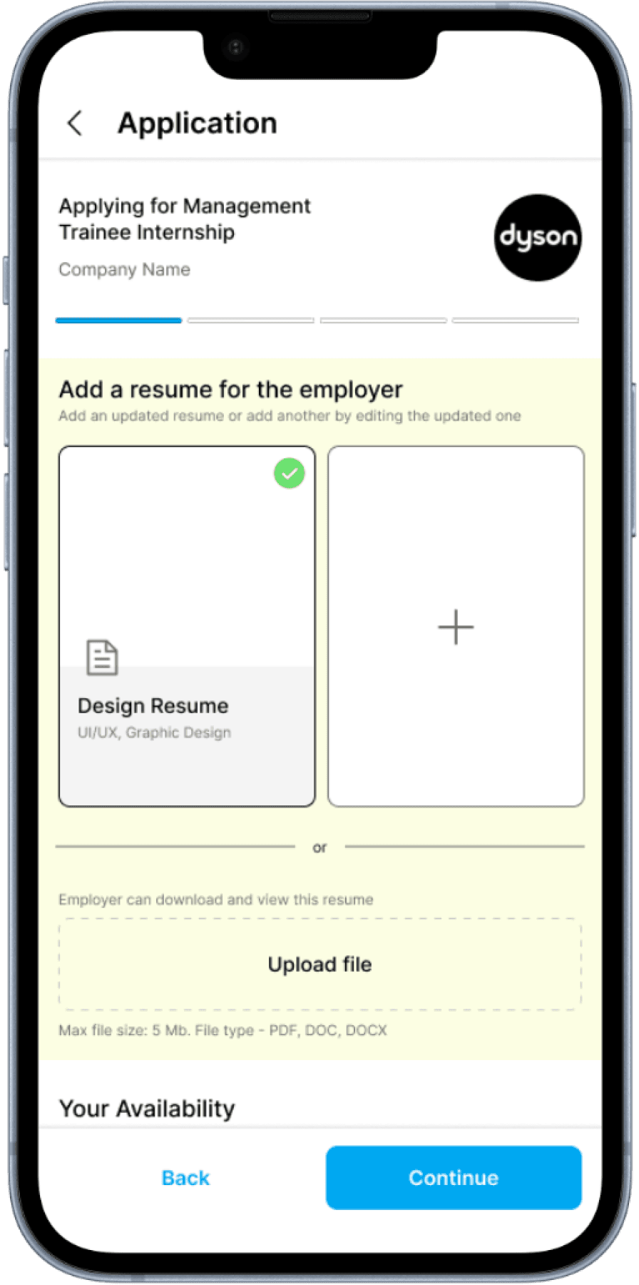
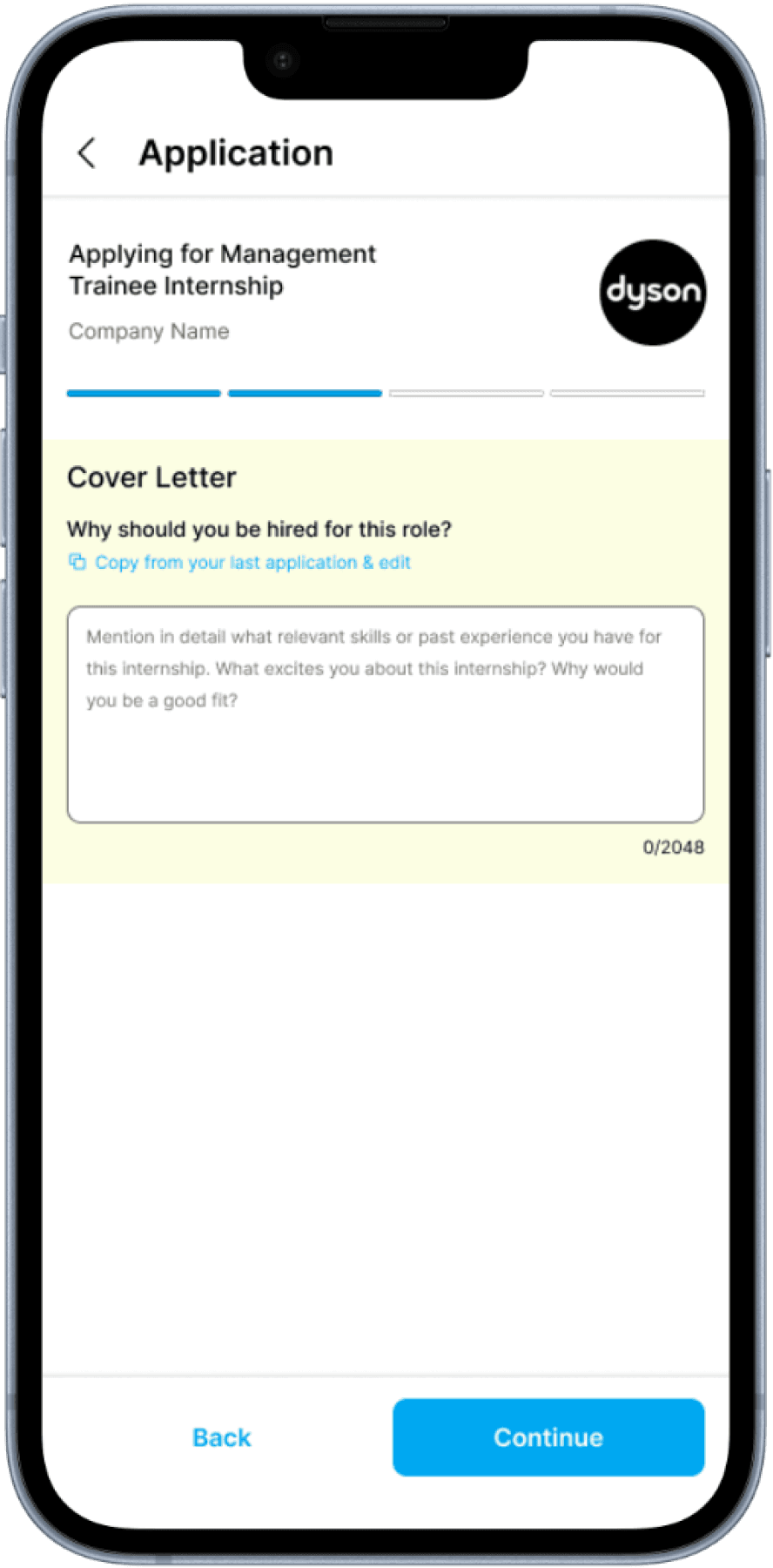
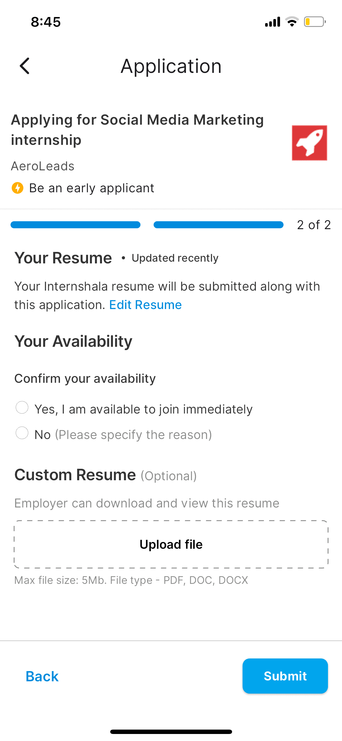
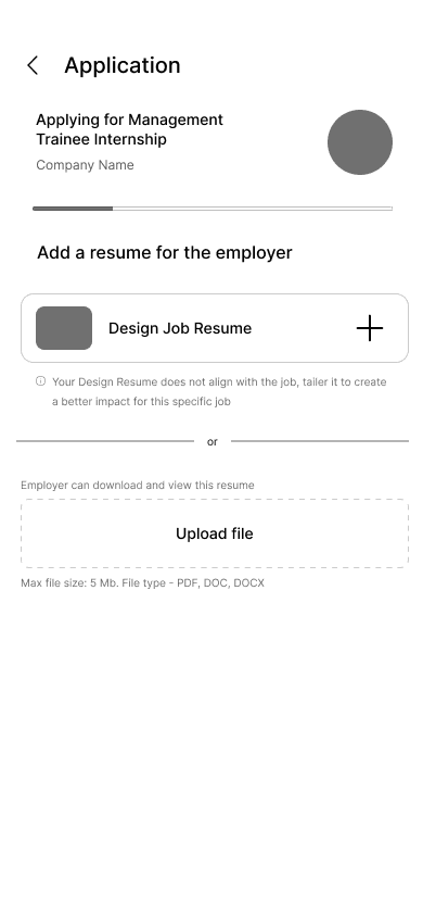
Resume usage, status system
To design journey of usage of the resume involved rethinking of the application process itself. This could have been done in the way the old design does, by tweaking in little changes. But, as I started doing so, I realised that the application submission process lacks progressive status system as well as a clear grouping of information to let the user understand the steps taken.

Final Version
✅ Layout difference to communicate the different resumes
✅ Easy access of resume, tailoring resume
✅ UX copy encourages an easy way to tailor resume
First Iteration
The first iteration (wireframe)
❌ Visual focus is lost in repetitive layout, both the resume look alike
✅ Easy access of resume, tailoring resume
❌ UX copy has a negative assertiveness
The application process should take one step at a time, with focus on one task, to remove cognitive overload on the user.
The application process should take one step at a time, with focus on one task, to remove cognitive overload on the user.
The application process should take one step at a time, with focus on one task, to remove cognitive overload on the user.


Design decisions and heat maps
There are two major steps that I took particularly, convey that the focus is not towards just redesigning but towards aligning the goals of the user. First, to add an option to read articles, right after resume building. The feature is added to build user retention, and provide knowledge within the app itself.
Second to add yellow colour at the back of the application questions. The goal is simple, to create a center of attention on the screen that does not let the user distract from itself.
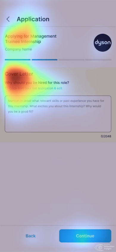

What heat maps indicate:
1 A visible concentration on what is useful
2 Change in layout and colour background grabs attention
3 Although the CTA button has low visibility because of the user of two buttons, I had decided to let it that way to maintain flexibility of going step back.
What heat maps indicate:
1 A visible concentration on what is useful
2 Change in layout and colour background grabs attention
3 Although the CTA button has low visibility because of the user of two buttons, I had decided to let it that way to maintain flexibility of going step back.
What heat maps indicate:
1 A visible concentration on what is useful
2 Change in layout and colour background grabs attention
3 Although the CTA button has low visibility because of the user of two buttons, I had decided to let it that way to maintain flexibility of going step back.
Thankyou for reading!